by Noah Feb 21,2025
Unlocking the Mystery of "Angry Kirby": A Look at Nintendo's Localization Strategies

This article explores the fascinating evolution of Kirby's image in Western markets, revealing why the cute pink puffball sometimes sported a more "determined," even "angry," look on game covers and promotional materials. Former Nintendo employees shed light on the company's localization decisions and their impact on Kirby's global branding.
A Tougher Kirby for Western Audiences?
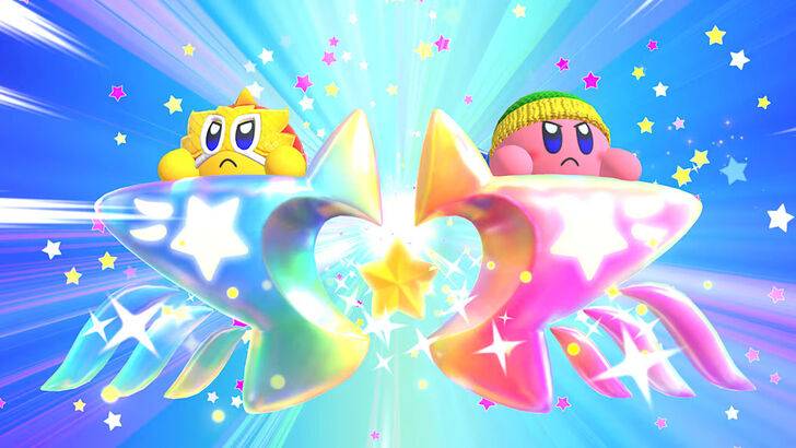
The shift towards a more intense Kirby image in the West wasn't about anger, but about perceived appeal. Leslie Swan, a former Nintendo Localization Director, explained that while cute characters resonate broadly in Japan, Western markets, particularly among teenage boys, often preferred characters with a tougher edge. This led to the fan-dubbed "Angry Kirby," a stylistic choice aimed at broadening the game's appeal. Shinya Kumazaki, director of Kirby: Triple Deluxe, confirmed this approach, noting that while cute Kirby is a major draw in Japan, a more battle-hardened image resonated better in the US. He emphasized, however, that this strategy wasn't universally applied across all titles.
Marketing Kirby: Beyond "Kiddie" Games

Nintendo's marketing strategy played a crucial role. Krysta Yang, a former Nintendo of America Public Relations Manager, revealed that the company actively sought to shed its "kiddie" image during a specific era. The "Super Tuff Pink Puff" tagline for Kirby Super Star Ultra exemplifies this shift, aiming to attract a broader, older audience. This focus on combat and action in promotional materials aimed to reposition Kirby beyond a purely children's character. While recent years have seen a more balanced portrayal, the perception of Kirby as "cute" still largely prevails.
Localization Challenges: From Ghostly White to Consistent Branding
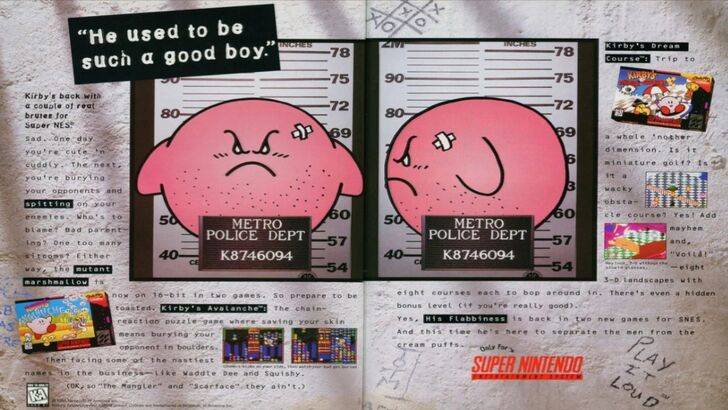
The differences between Japanese and US localization began early. The infamous 1995 "Play It Loud" mugshot ad marked a turning point. Subsequent game box art frequently depicted Kirby with sharper features and more intense expressions. Even the color palette was adjusted; Kirby's Dream Land's US release featured a ghostly-white Kirby, a decision linked to the Game Boy's monochrome screen, but one that later proved a marketing challenge. The eventual shift to a more consistent, though still sometimes "tougher," Kirby across regions reflects a changing strategy.
A More Global Approach
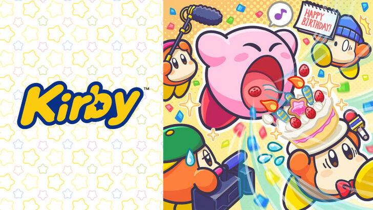
Both Swan and Yang agree that Nintendo has adopted a more unified global strategy. Closer collaboration between Nintendo of America and its Japanese counterpart has resulted in more consistent marketing and localization. The company is moving away from regional variations and aiming for a more cohesive brand image worldwide. While this consistency offers benefits, Yang acknowledges potential drawbacks, suggesting that a focus on global appeal could sometimes lead to less distinctive, "safer" marketing. The shift also reflects a broader industry trend, with Western audiences increasingly familiar with and receptive to Japanese pop culture.
Pokemon TCG Pocket: Paralyzed, Explained (& All Cards with ‘Paralyze’ Ability)
Mobile Legends: January 2025 Redeem Codes Released
GWENT: Top 5 Decks for 2025 - Strategies Revealed
Android Action-Defense
Brutal Hack And Slash Platformer Blasphemous Is Coming To Mobile, Pre-Registration Now Live
Pokémon TCG Pocket Is Dropping a Trade Feature and Space-Time Smackdown Expansion Soon
Mythical Island Debuts in Pokemon TCG, Time Revealed
Marvel Rivals Showcases New Midtown Map

Summer Game Fest 2025: Future Games Show Highlights
Apr 18,2026
Marvel's Hellfire Gala Promotes Fitness with Zombies Run
Apr 15,2026

Tower Dominion Redefines Defense With Custom Battlefield
Apr 15,2026
Take-Two Chief Bullish on Nintendo Switch 2
Apr 10,2026
Chadwick Boseman to Receive Hollywood Walk of Fame Star This Month
Apr 06,2026